Monday 31 October 2016

Arduino Workshop

The Arduino project is based on microcontroller board designs. It is an open-source project that created for building digital devices and interactive objects that can sense and control physical devices. 


We downloaded the Uno which is one of the most popular boards in the Arduino family. As the picture showed below, those ten lines of code are all we need to blink the LED on the Arduino. I've changed the blink frequencies by adjusting the delay from 1000 to 100.  This is to reduce the LED blinks. 


Afterward, we settled up the program and then we started to learn the different varieties of Arduino board that I attempted to connect the pins. It was really frustration and disheartened for me because I had no idea about electronic things. 

Sand mapping project

This magic technology has combined the art and science to created a wonderful world for viewers. 


Future with bright light


As lecturer shared on the Facebook group, I found it is very interesting. In the video, a pen can transmit electricity with its silver ink. According to my research that this technique are made by a Japanese infrastructure company named Kandenko. they used a tiny 3D miniature paper town comes to life as the pen simultaneously conducts electricity as a person draws lines.

Throughout this lecture, I've learned some basic fundamental electronics and a decent understanding of Arduino. 


Referencing list

(株)関電工 (2016 30 06). Future with bright lights [Video file]. Retrieved from https://www.youtube.com/watch?v=zRbQvEefhXc [Accessed 31 October 2016].

Saturday 29 October 2016

Reflection and Review of Mapping Activity


The task here was to review the second maps and compare with each other to see what reflection and thoughts we have incorporated in the map.
The following photos were students' maps. 


The production of creativity has incorporated with the map. I like how it formed as an old motion picture film that gave the audiences an atmosphere of reminiscence and dramatically emotions. The 'making of ' of this map was that designer took the photos of his key moment and then made them as a form of motion film picture. 


I like the layout of this map as it presented content in a way that guides viewers through identifiable landmarks of the media city. There is a girl travel from  and it seems a photos album rather than a map. In addition to the layout, I can see the personality of the designer. She used digital painting to visualised her memory.  


This map was very interesting, it was a 3D paper craft that presented the lecture moment. It has effectively visualised her key moments such as several students sat there with a coffee on the table, their expression tells viewers that they were concentrating to the speech... This is a good idea  to compelling story as viewers would be attracted by the 3D object and spend more time to read it. 


The illustration and iconography were two main visual communication elements in this map. I can see the symbol of "M" which clearly indicated the media city, this was simple and easy to understand and universal. They enhanced comprehension and does not make viewers feel distracted at all. 


Typography, colours and iconography had been incorporated on this map. It was outstanding and highlighted the important information for viewers. I can clearly see the route and the landmarks that contain the Quays, bridge and Imperial War Museum. 


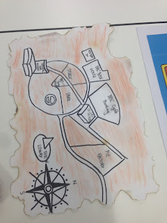
The photo above was my own map. This time I've incorporated several techniques such as colours, iconography and simplicity to visualise my journey for audiences.  I used colour to represent each landmark. For example, I chose red to indicate The University of Salford, green to express the garden, yellow and orange to symbolised the tram and grey  to imply the Imperial War Museum. I believed that colours can easily demonstrate the meaning and communicate with audiences. 

In addition to colours, the iconography also enhanced viewer's comprehension as all the shapes were drawn according to realities. A good example of iconography can be The Imperial War Museum, I draw it as a shell because the building was slightly curved and unique.   

In conclusion, the task has made me slightly understand the connection between the map and 'making of'. We considered our A and B, we took the photos of landmarks, We attempted to use different methods to visualise our journey...

We drew it, digitised it, and even made it into 3D models... This has made me understand that visual communication is not limited on sketches, it can be divergently and changeability.  

In addition to the divergent methodologies, the task also incorporated a number of techniques such as colours, layout, iconography... They helped us to highlight the important information, to  maintain consistency, and to enhance comprehension.  

The map was the reflection of our memories, the 'making of' of this map wasn't easy, we documented everything include other's works, observe and analysis someone else's' maps in order to enhance our own development. From this task, I've gained a lot of visual communication skills and become a better storyteller. I will make sure I apply these knowledge into my future project and become an effective storyteller.


Friday 28 October 2016

Pendulum Exercise

On week 5, I did the pendulum exercise. To figure out the timing and arc, I designed to start with  the pendulum in Maya first. 


 I felt that doing pendulum on Maya wasn't hard however I stuck on the tangent for whiles. 

It was slightly confusing to use free tangents on the graphic editor because I haven't been figured out all the functions of the buttons and it can easily cause the mistakes.  


Eventually, I've solved the problem by reading through the Blackboard instruction, followed it step by step to approach the final result. The curve changed from linear to arcs which also changed the smoothness of the pendulum. 


I found out that simulated the exercise on Maya can easily make me understand how the arcs and bouncing of pendulum works. I also completed the bar sheet with this graphic editor. 


Finally, I moved on the stop motion room. Initially, I tried to do it without the guide and it worked awfully. Therefore, I drew an arc on the table just to help with the direction. It looks better than last time but I still have lots of things to improve such as when the block step back to prepare jump, it looked very stiff and unnatural. Furthermore, I would like to improve the arc because it looked more like an oval rather than a semi-circle.  


Friday 21 October 2016

Team & Testability

Presentation of Kristina


Career journey

A level - gap year ( worked in Cash Generate) - The University of Salford (degree of Digital Media) Work experiences in different companies -BBC graphic designer

24Design
Animation /3D space/ museum

BME

Manchester Airport
We used spider map to expand the ideas and look at the project from different points of views. 

Design a better yoghurts experiences

We worked as a group of four and observed 2 users to eat the yoghurts. Throughout the experiment, we came out with various ideas of designing better yoghurts. Everyone has to write down as many ideas as they can in 2 minutes.  It has pushed my limitation and developed an understanding of playfulness in the context of design and animation.


The task here was to sketch out the idea of a better yoghurt design, then passed to the person next to you to improve or divergent the ideas in order to make the yoghurt better. I felt this was very interesting as I can see how others comment on my design and how would they improve the yoghurt package.


This experiment has developed my creative problem-solving skills and team working. I felt it's interesting to share the ideas with others and comment on their designs. In this task, I've designed tow-sectioned yoghurt container, one section filled with yoghurt and another one will be toys or decoration. I felt depressed when someone commented that '' Toys are only for children, adults do not need them anymore.'' It's depressing to see some people gainsay my design but it also made me realised that my thoughtless of target audiences. I should have considered my target audiences and expand them deeper to see what consumer might think about it.


Photos of other groups' working on tasks


Photos of my group listening to the lectures.