Friday 23 December 2016

Start Painting

I have chosen this photo as my main painting for making of. Not any particularly reason, I just like how the woman sits on the chair with one hand hold her cheek. She looks so relaxed and seemed to dream of something. 


Process of Painting 

I looked few painting tutorials on the YouTube and found out that most of the digital artist like to paint in grey first, and then start to colour in different colours. I haven't know the reason yet, but I tried it the same way and it sorted gave me a clue that why they did it. I think it would give them a better understanding of shadows and lighting, as the different level of greys has shown all the shadows such as creases, so when they colour it, they don't have to think about shadows anymore. 


I always would like to sketch out the character first because it would be easier for me to outline on the Photoshop.


Painting

I decided to paint on the  Photoshop instead of Flip book. This idea was inspired by a gorgeous photographic that were took by a jewellery designer in China.

Here are some photographs he made


I really like the dresses, especially the patterns on their skirt. It's gorgeous, not only the traditional Chinese costume but also the jewellery they wore. 


Friday 16 December 2016

Week 12

In week 12, we had to come up with some idea about mini project ''making of'' , so I went back to watch the video of The making of The Gruffalo's Child again. 


This is a normal making of video, but what impressed me the most was that they explained the production of the Gruffalo's child. In the video, they first showed us the scene of Gruffola's child shouting ''big mouse'' and then insert a 40 years old female voice actor in the studio recording it. It literally surprised me because I could not believe that a mid-aged woman can make sound like that. I think this is the reason why we look the making of, audience needs to see how amazing the behind work is and how is this story been produced. 


Thursday 15 December 2016

Final Presentation

In the last week of Intro to Creative Play, we finally finished all the physical projects and presented it to the class. 

Our idea of City project is human evolution as we had to demonstrate the difference between old and new. We believe that evolution would be a good approach to depict how society has moved on from ancient to modernism day.  

We incorporated the technique Projection mapping to emphasis the pattern and it worked very well, it added the vibrant and culturally to our city.  This was kind risk taking as well because there's possibilities that we might fail it. When we did the experiment of projection, the African pattern video we made was projecting on the city set. However, when we moved to the DPL, the illumination was unsuccessful because it was too big and most of the apertures were mapped on the black floor. However, it actually looked pretty good than the project on the tin foil city. It emphasized the pattern and colours, as well as showing the slow motions, it also enhanced the prominent cultural themes. 

Another risk taking thing is that we used tin foil to wrap up up the buildings. As we know that tin foil is very easy to break, I had to draw pattern very carefully to avoid of rapping it. 


In the production process, we worked as part of the team and knew what exactly things each member should do. Harry was our team leader, James was responsible for making the model and I worked on the African patterns. According to my research, the 
African patterns are often used as a form of coded information. Parallel, zigzag, cruciform, curved spiral lines and so on. These can denote social status or have magical or religious powers. 
In the other words, the patterns are the reflection of the human cultural, and the cultural is a very important element of development of human evaluation. 

I think our project worked quite successfully because we meet the requirement, we used techniques associated with risk taking in a creative setting and we respond to the city project very well. However, if we were going to do it again, we will make some green screen footages as the transition to the project, we thought we did not have much time to shoot, but we actually have plenty of time left. We could utilize that period of time to shoot the video and make a short animation based on our city set. We could have done more experiment to our project and make it better. 


Another improvement we could do is using a cake stand spinner to rotate the city set. It would give audiences a 360 degree of perspective view, and it adds fun to the city as well as enhance the interactions. 


People set up the city sets


Other group's works


Tuesday 13 December 2016

Casebook

In week12, Our group has finished all the physical buildings. Now we are heading on the casebook and presentation. 


Sunday 11 December 2016

Manchester Art Gallery


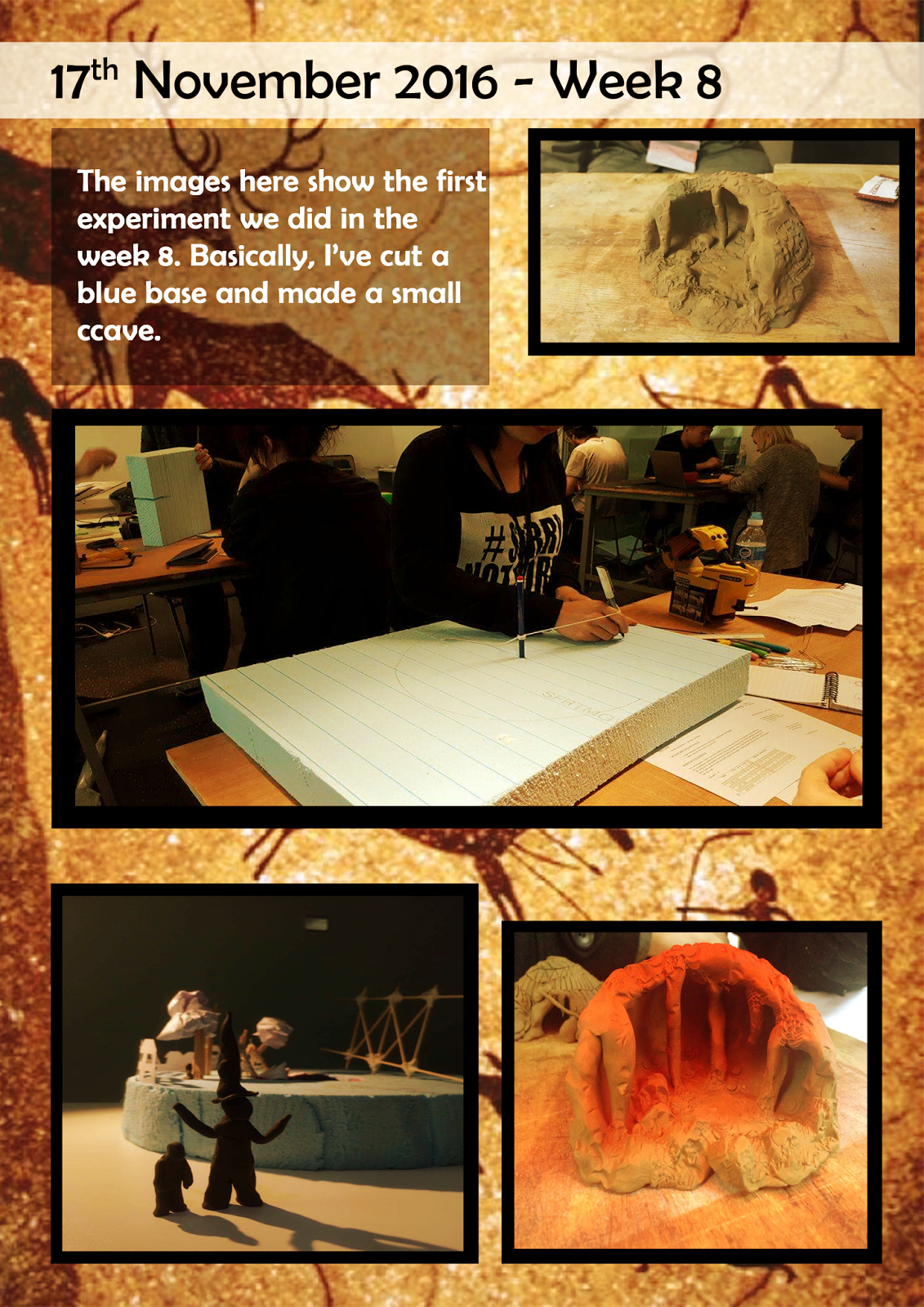
In week 11's Animation context, we had a tour to the Manchester Art Gallery. There are hundred and thousands art collection in the gallery. The following photos are the arts that I interested. 


Vase

I really like the colour and engraving of this ceramic. The pale blue of the porcelain set off the tone of purity and naturalism. Not to mention the exquisite carving. The bottom of the vase revolved around two naked men, who seemed to be supporting the top of the vase. Each inch of their skin and muscles are carved in great detail. This is a gorgeous Jasperware! 


Bestie 


The reason that I liked this piece of artwork is the horse looked very feminine and unique. Usually, the horse people see in the life is characterised by an athletic and muscular feeling. However, this one isn't. It's been covered with a circular pattern of black lace, which is particularly mysterious and unique. 


Eva Tempted 

This painting depicted the temptation of Eva from the Bible story in the book of Genesis. As we can see that the naked figure of Eve strands beneath the Tree of knowledge on a carpet of blue, white and yellow flowers and grass, with one hand leaning against the earthen bank behind her, the other reaching up over her head to grasp an apple.  
On the left, a blue serpent with a hideous human head and red hair, entwined about the trunk and branches of the tree whispers temptation, in the form of steamy breath, into Eve's ear. (referred from http://artuk.org/discover/artworks/eve-tempted-206097)


Roses 

This is one of my favourite painting, the combination of beauty and death. Obviously, we can see that this is a rose from its leaves. However, this plant does not breed roses, but skulls. Those skulls look very creepy and thriller. It conveys a tone of death spreading in the midnight. I believe this is very novel and easily to attract the people's attentions, it is thoughtful. 


Saturday 10 December 2016

Bouncing Ball


Here are several bouncing  ball animations that include: the ping-pong ball, beach ball and the bowling ball. 

Ping-Pong Ball

On the bar sheet, I drew quite a lot of bounces there, because ping-pong featured on weightless and bouncy. Therefore, it wouldn't stop easily. 


The ping-pong ball did not bounce well in the video. The ball seemed floated in the air and the arc seemed very weird too. I could lightly draw a guide line on the table first, in order to create a perfect bounce curve.  


Bowling Ball 

Bowling Ball featured on heavy and large. Therefore I only drew one bounce on the bar sheet.


However, there is some difference between the bar sheet and actual animation. I did three bounces and on the third bounce, the ball seemed to snap for a moment. I think it perhaps because I accidently deleted few frames. 


Beach Ball

This is my most satisfied bouncing ball animation- Beach Ball. I think it's bounced really well.  As you see the arc, timing and spacing all been arranged perfectly. The only pity thing is that the ball has jumped out of the scene, which is not allowed. If I have more time, I would adjust it and make the ball bounces within the camera scene.  

Friday 9 December 2016

Maya exercise_ Spaceship

Here is the spaceship Maya exercise that I've done whiles ago, but forget to record on the blog.


Overall, I am quite pleased with spaceship exercise. I found it's easier to animate in the Maya with instructions, I can always follow it step by step and complete successfully. 

However, without instruction or tutorial, I would struggle with start point. For example, the block interaction I did last time. I was very struggling on how to make block trace behind, how to manage to incorporate the emotions to block and so on.  


As an animator, I will watch more Maya tutorials and do more practices on the Lyda.com. I will make sure I familiar with most of the basic tools and be able to animate the character in the future.


Ballon Bouncing


I did the balloon bouncing animation again and it's slightly better than last time. 

The good thing is that the penny looks lighter and slower, which felt like a proper balloon. Last time, my balloon stop motion animation looks floated and unnatural. 

However, I still have to improve because it bounced like a beach ball. It would be better if I change the arc or direction of the balloon. 


Here is the Maya bouncing ball. There are several things I can improve. Firstly, The ball does not bounce around, it only stays on one point.  Secondly, it bounced too quick when the ball comes to the end. Logically, the ball should slow down because of energy losing. At last, I noticed that it did not stop naturally, there should add one more bounces before it stops. 

Thursday 8 December 2016

Final Production and experimentation

In week 11, Our team has came to the final step of our building set, which decorated the ground with sand and projecting it under the patterned lighting. 


James and me bought a bag of sands and several bottle of spray adhesive to decorate the base. We attempted to make the ground as realistic as possible but it seemed did not work well because of the glue was not strong enough to stick the sands. 


Another risky things we did is to spray the silver paint on the sand in order to make it look shinny. Obviously it did not work out because of the health and safety. Fortunately, we used glitter to replace the silver spray. It remains shinny and metallic.


Then, James had made a base for the set because the cardboard was too thin to break off, therefore we need extra support to hold the sets. And it looked amazing after wrapped up with foil papers. 


Experiment 


We also incorporated the technique, Project mapping to projecting the Rotoscoped pattern on the sets. 

Harry designed an animated circular pattern video with Illustrator and Affect Effect, and then projecting it on the set. 


It works pretty well as the tin foil bouncing back the light and it creates a feeling of mystery and culturally diverse. 


 In Africa, some patterns are often used as a form of coded information. Parallel, zigzag, cruciform, curved spiral lines and so on. These can denote social status or have magical or religious powers. 

This powerful and expressive elements are the best reflection of  history and cultural. We decided to use the pattern as the main element across through the entire set, from cave scooped to tin foil drawing.